New look, new focus
Relaunch of the Datwyler website
25 April 2024

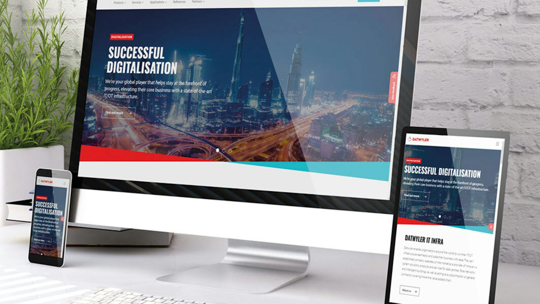
Since the end of March, the Datwyler IT Infra website has been completely revamped in a sleek contemporary design. The focus is on optimising the user experience by tailoring it to the special requirements of our customers, prospects and partners. Thanks to the new mega menu, which displays several levels at once, visitors to the site can find the information they want with only a few clicks.
Faster and more modern
Larger image formats, clear, attractive design and optimised navigation improve the visibility of the offering and create an airier appearance. The fresh redesign covers every aspect of the site: from the news, through the clear presentation of references and services, to the new download area which shows all the important documents and information at a glance.
Also new is the FAQ section, which gives quick uncomplicated answers to frequently asked questions. This saves time and helps to solve problems more speedily. The address overviews with built-in maps also ensure that it is easy to find our partners and points of contact throughout the world.
Technologically up to date
The Datwyler website is state-of-the art in terms of technology as well. A user interface optimised for mobile devices allows users to access the information relevant to them from anywhere and with any device. In addition, the link to the product database has been improved, which means that products can now be found more quickly. The enhanced search function also ensures that the best possible results are obtained.
“We felt it was important that the new website should not only look good, but should also permit fast, reliable orientation. Central to our offering are our customers and partners, who are supported by our optimised online functions in making the right decisions for their IT and OT projects,” commented Marco Müller, VP Global Marketing & Communication at Datwyler IT Infra.


